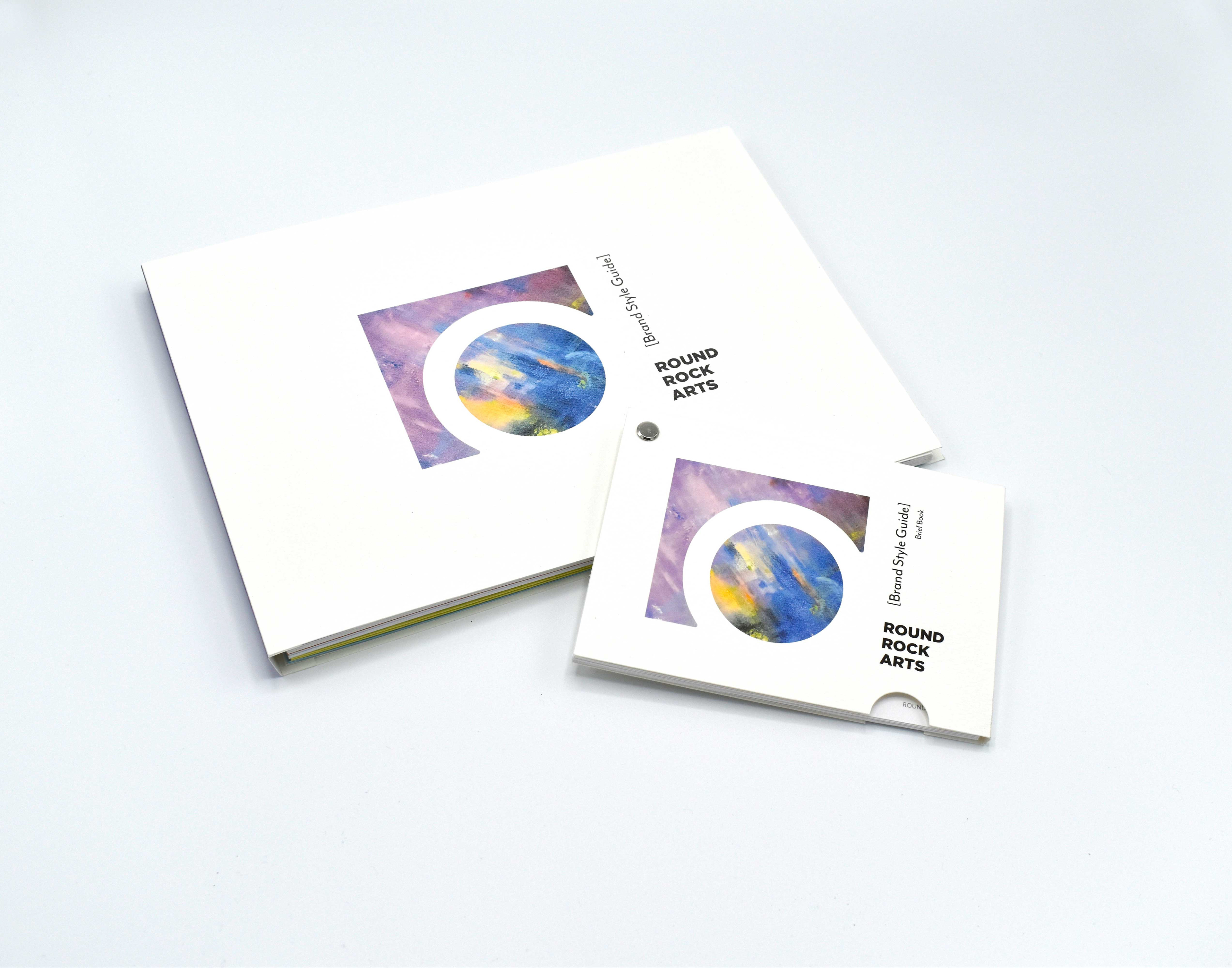
Branding Design . Style Guide Book & Brief Book . Business System . Website . Applications . Environment Graphics . Photography
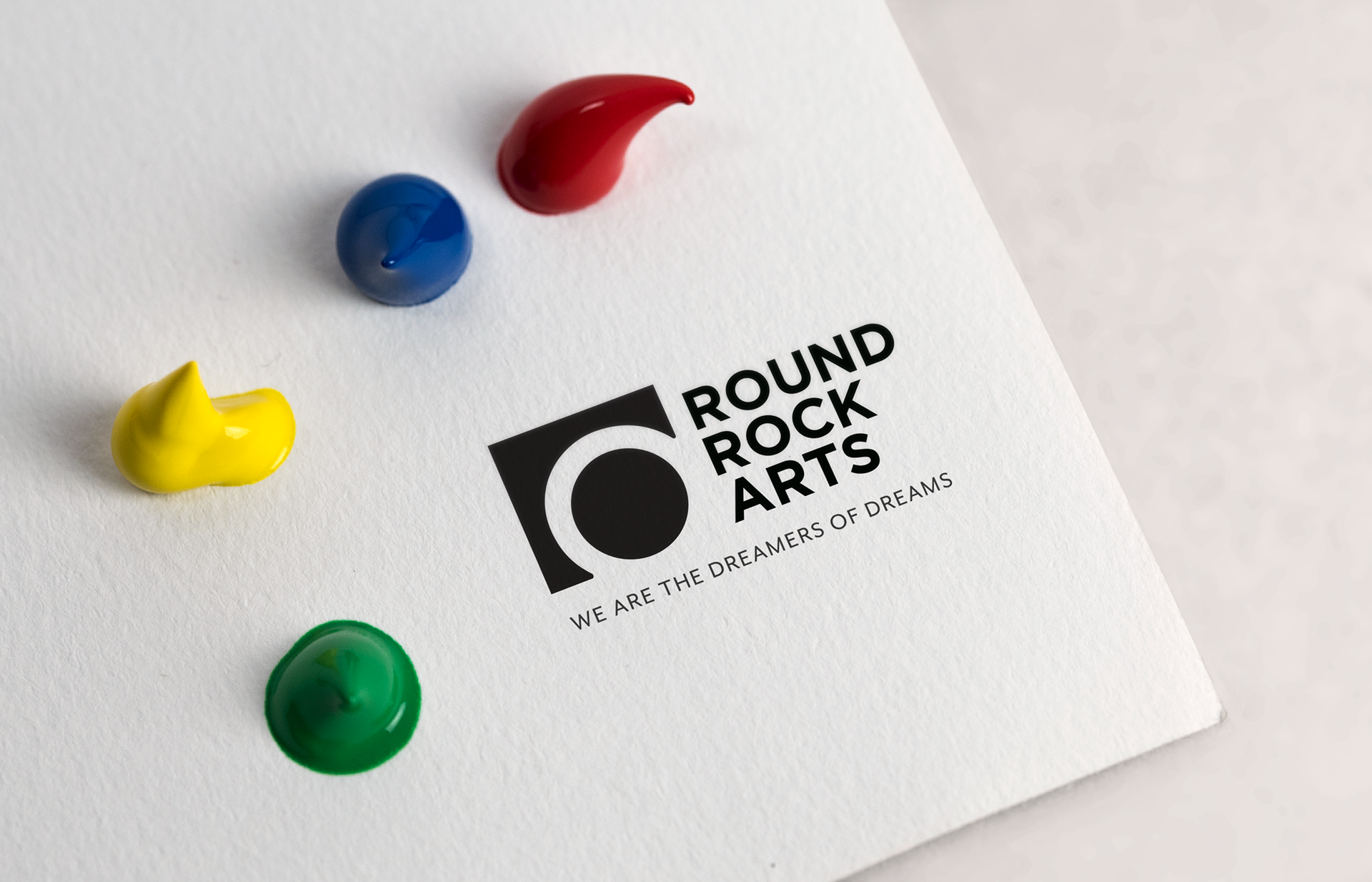
ABOUT THE NEW LOGO
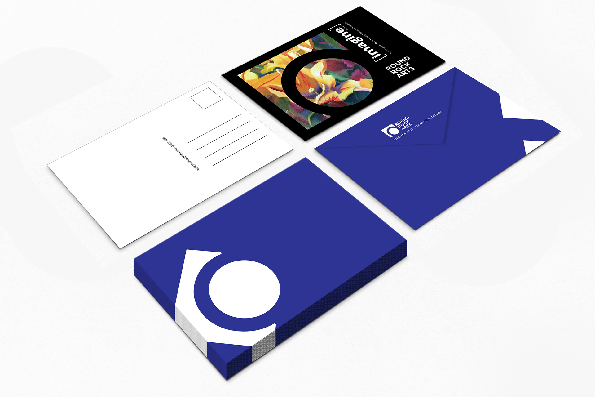
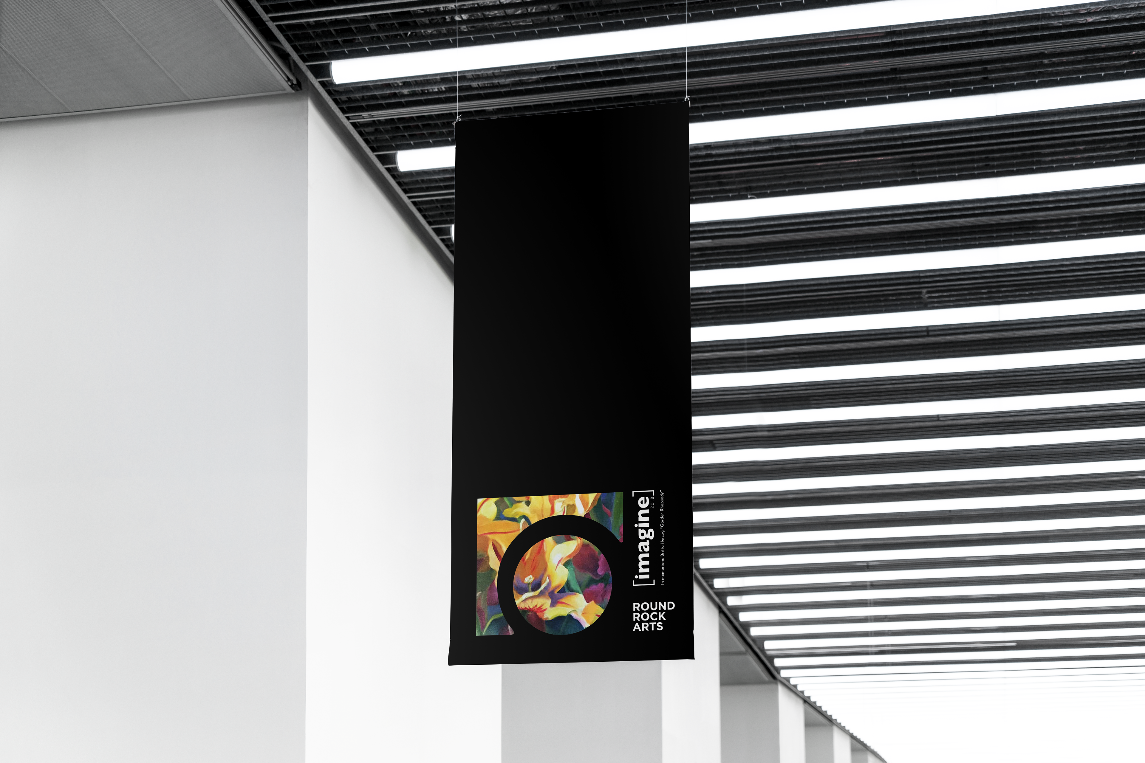
Round Rock isn’t just full of historical stories, but also it’s an artsy town that has been promoting fine art and supporting local artist for years. In this project, I combined the local culture with a new contemporary style to bring Round Rock Arts into the next level. The geometric polygon “r” implies Brushy Creek while the circle signifies the historic Rock. Moreover, the symbol connects the abstract lowercase “r” and the counter of the “a” to give a contemporary feel. The new color library also provides flexibility and a new personality.
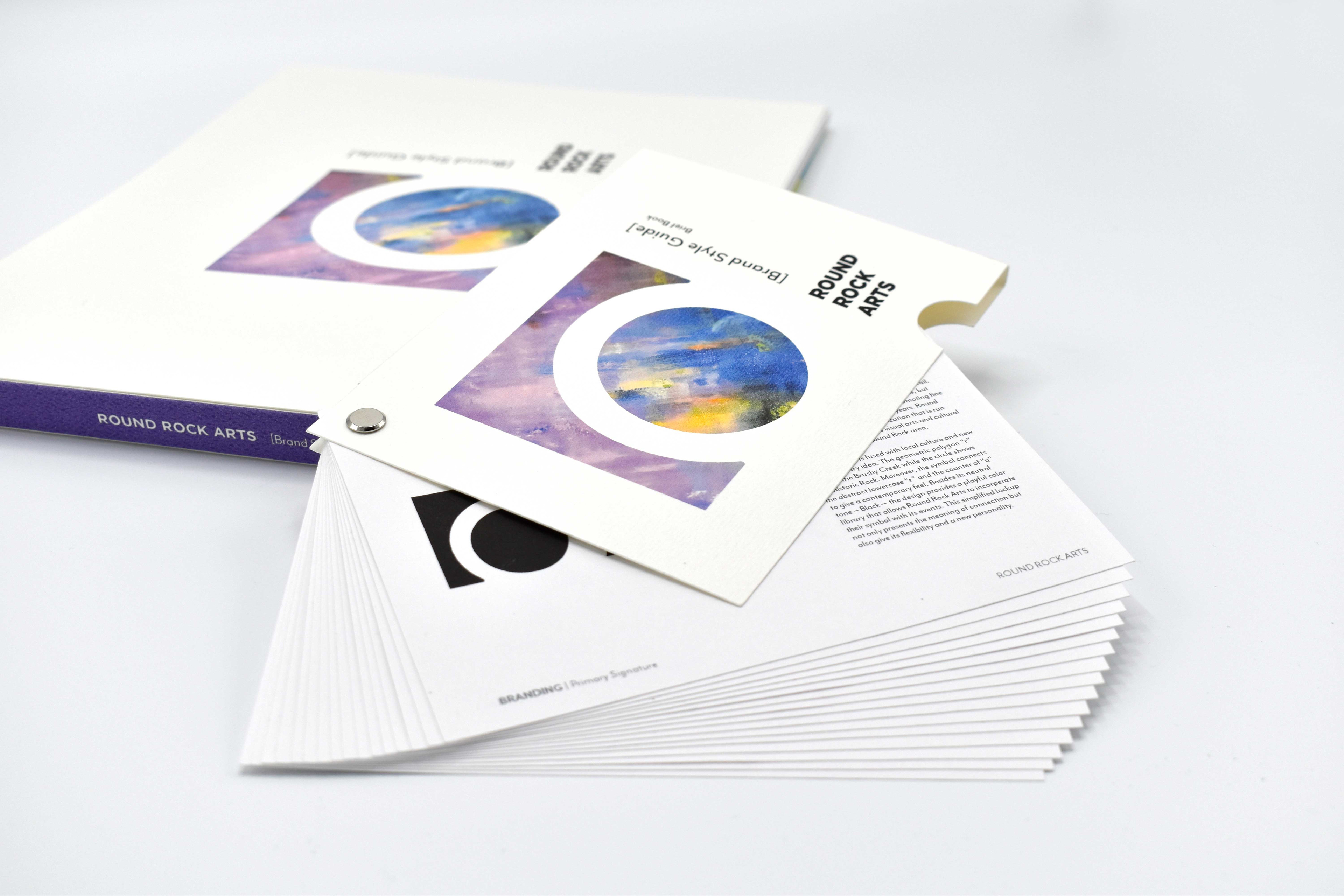
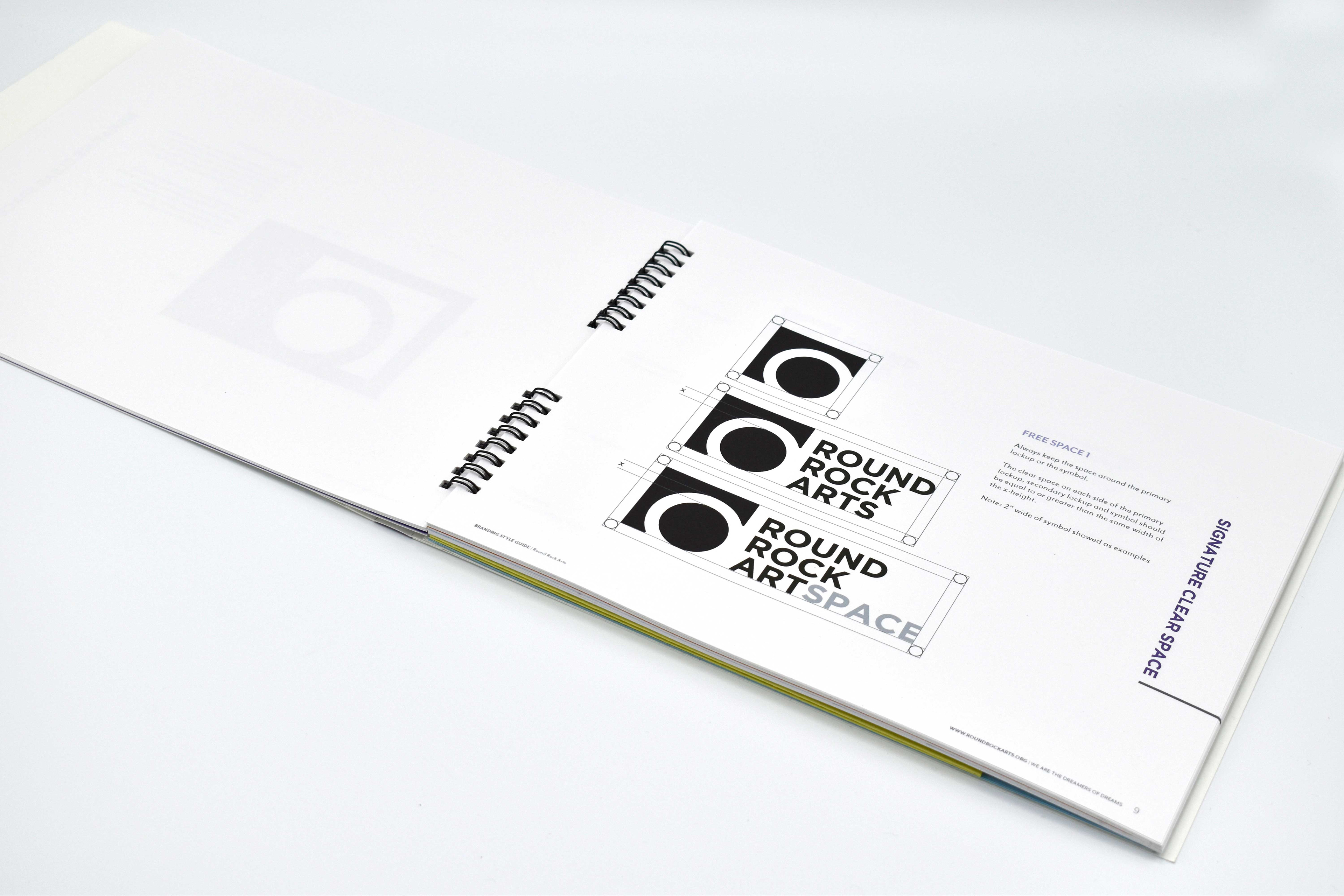
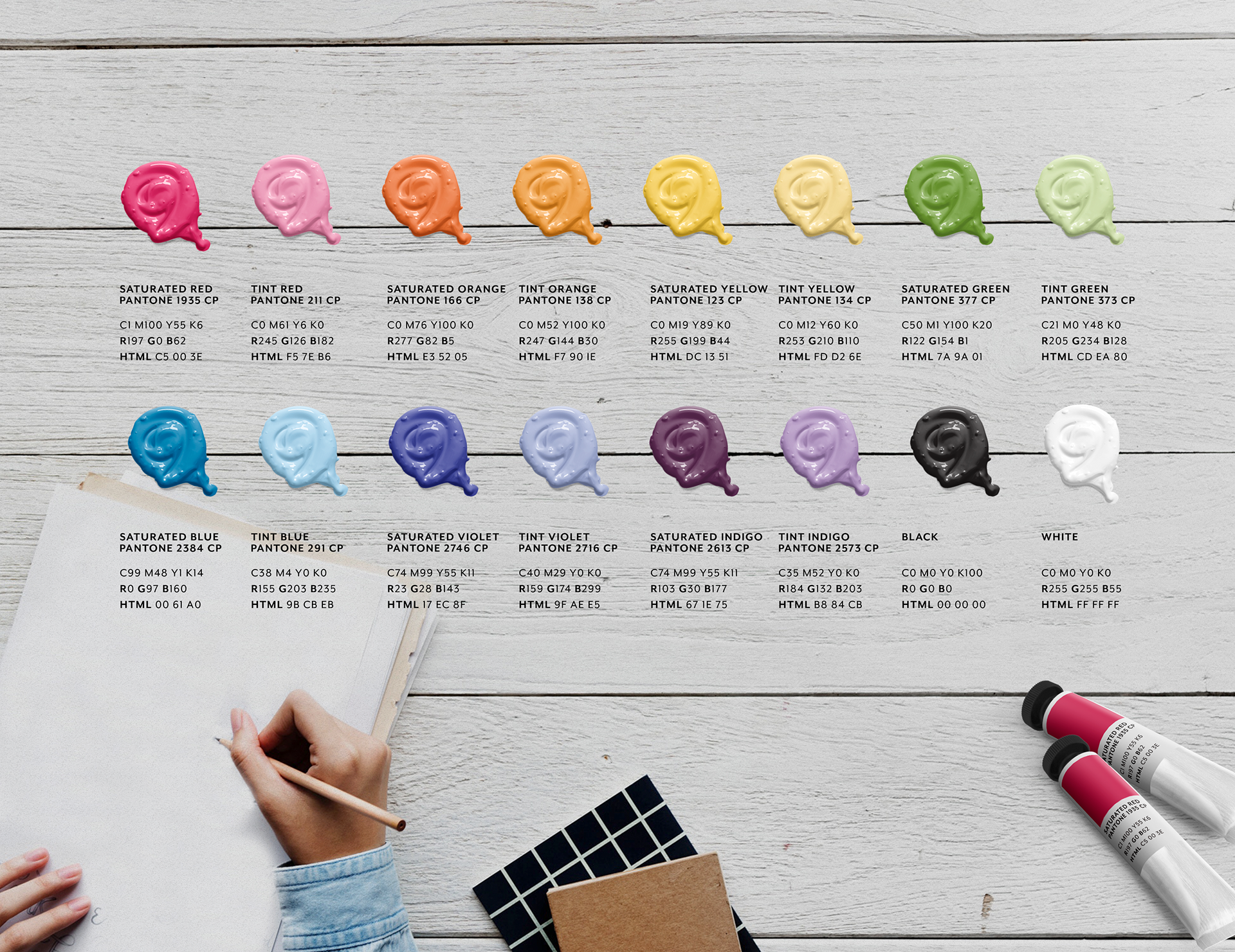
COLOR LIBRARY
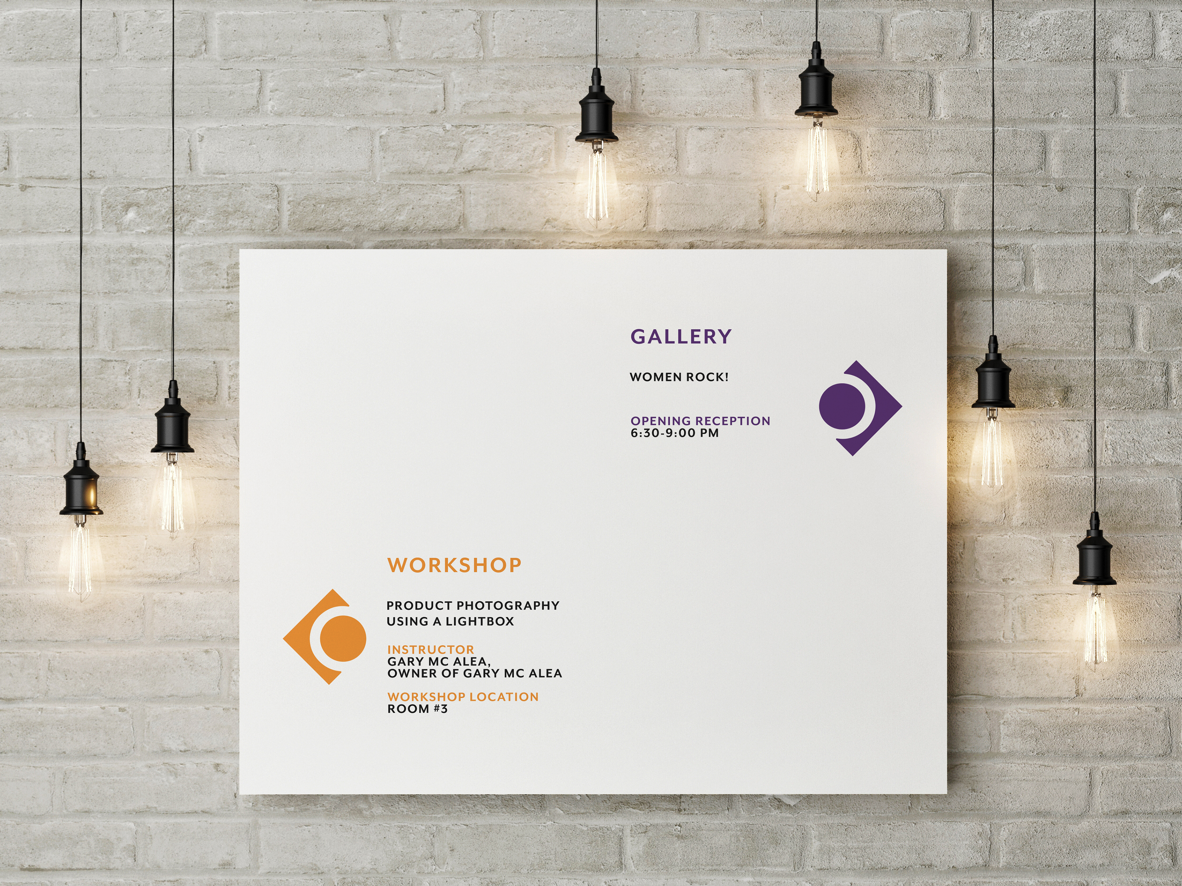
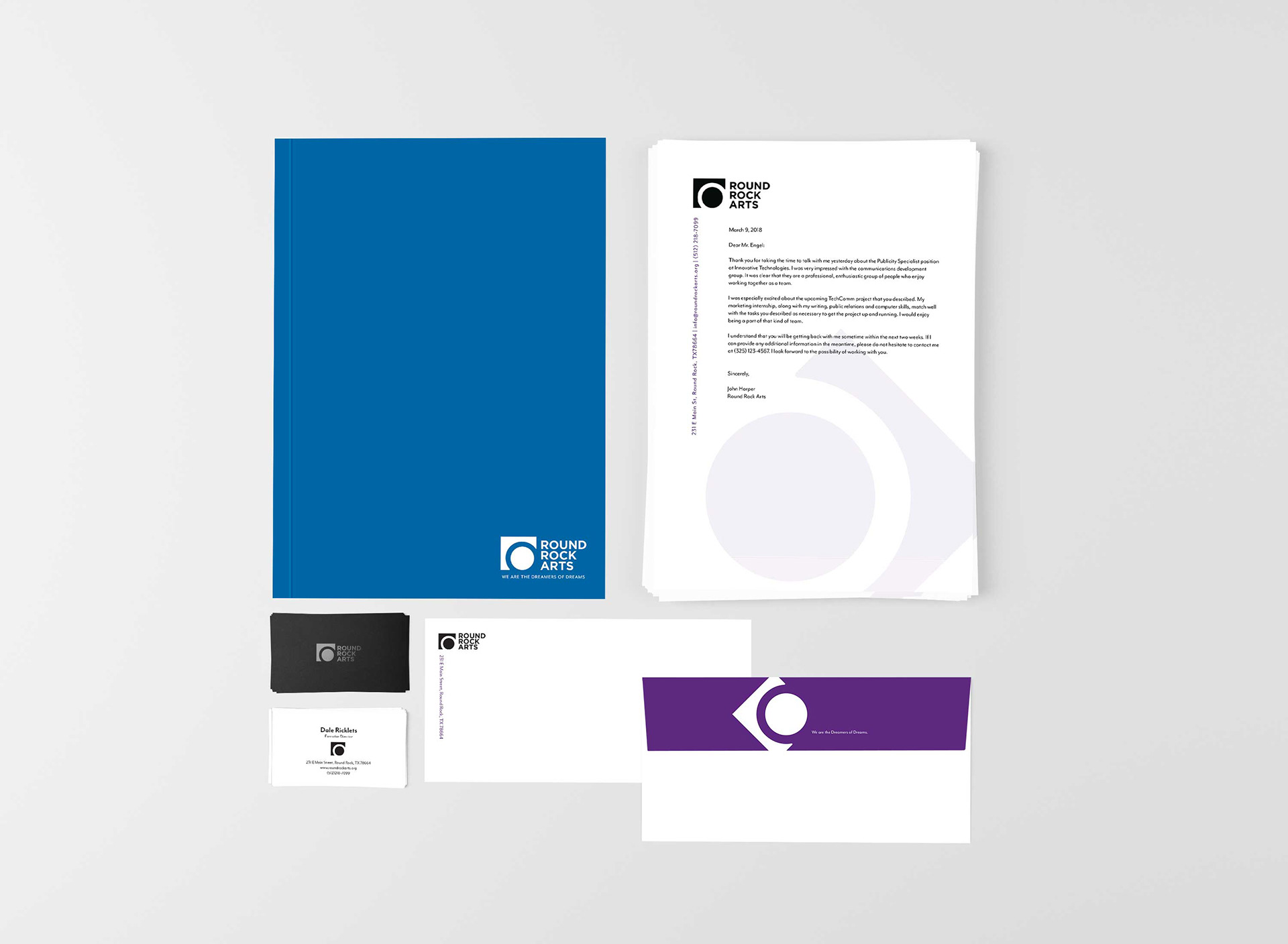
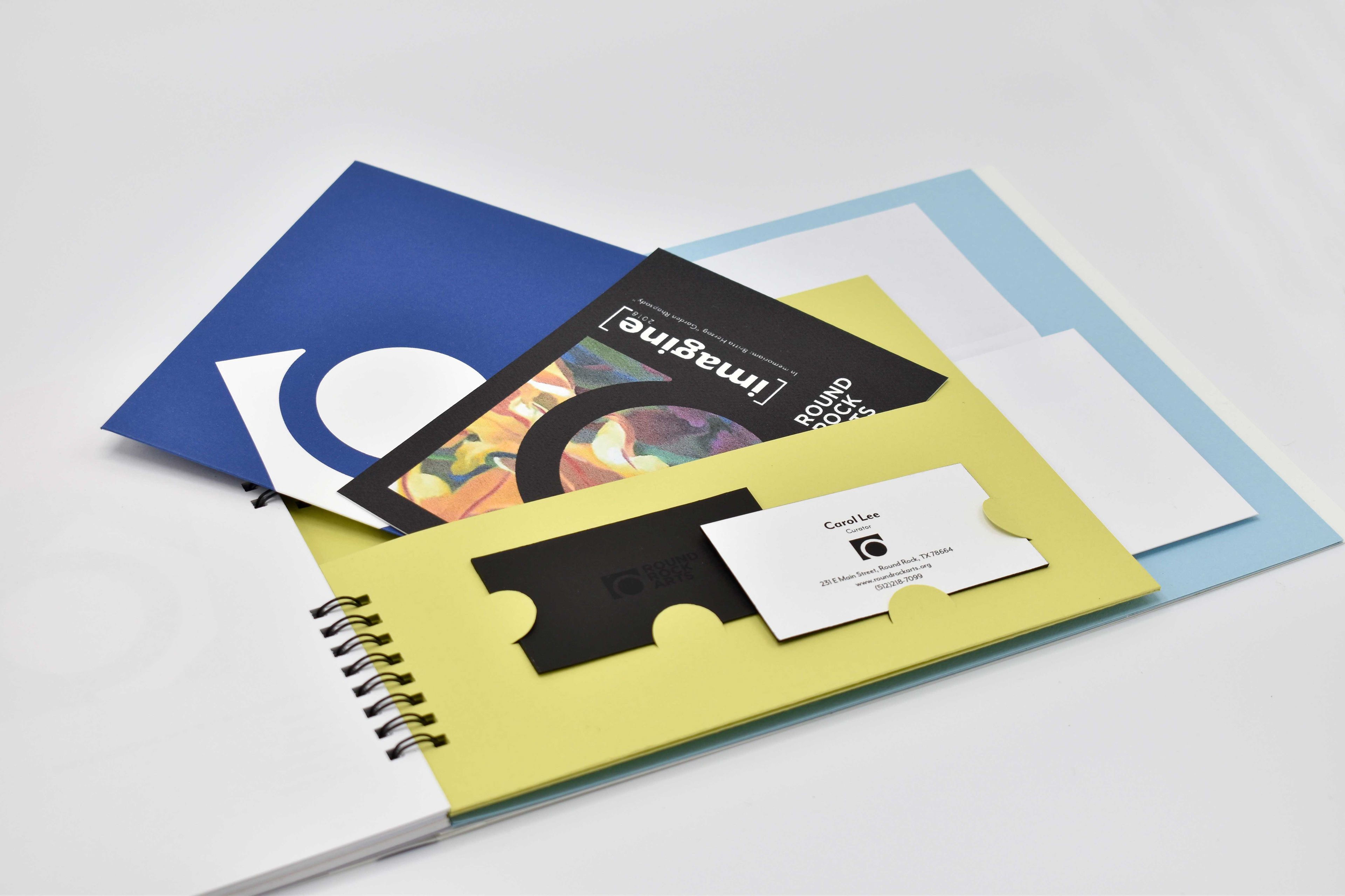
The primary markup has its neutral tone – Black – the design provides a playful color library that allows Round Rock Arts to incorporate their symbol with its events. This simplified lockup not only presents the meaning of connection but also give its flexibility and a new personality.